Graphic Designers Create Posters Showing Off Campus Life
There’s a kind of infectious enthusiasm inherent to a wall well-dressed in advertisements and announcements of student events, concerts, and organizations. In so many ways, Oberlin cork boards — featured at campus hot spots such as Azariah’s Café, Wilder Hall, and dorms — serve as de facto microcosms of the diverse interests and extracurricular pursuits sustained by Oberlin’s student body. Not to mention that Oberlin posters are fun to look at — visually engaging surrogates for our TikTok or Instagram feeds while we wait in line for a latte or bide time in the hallway before class starts. And yet, if you really think about it, a kind of mystery presents itself; with no graphic design classes available at our arts-focused school, who makes the posters we see everyday, and how?
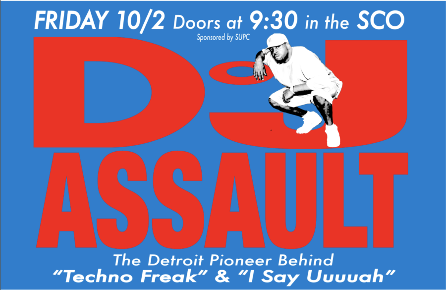
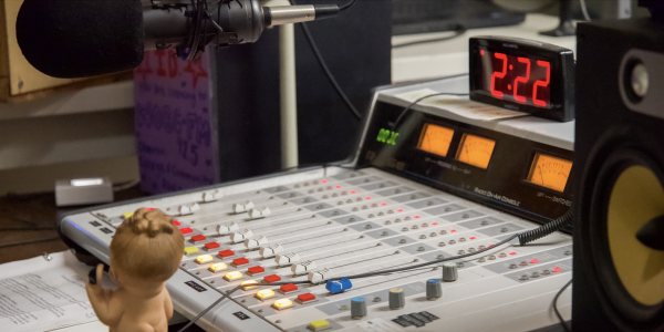
College fourth-year and virtuoso poster-maker Ben Burton had many of the answers I was searching for. They started working as promo director for WOBC during the fall of their second year, and since then they have acted as a freelance poster designer and promotional media creator for the Dionysus Disco, the Cat in the Cream, and Solarity. If you recall any especially stimulating posters circulating when big names such as Junglepussy, DJ Assault, or Girlpool came to campus — yeah, those were Burton. They make the kind of posters you’d want to hang on your walls, with dynamic lettering and stylish, funky graphics that catch your eye even amidst the crowded cork board chaos.
Burton did not begin their poster-making journey at Oberlin from scratch. They credit their foundational design fluency to their engagement with film-making and yearbook design in high school, the latter pursuit providing them with the opportunity to learn Adobe InDesign. Since then, they have transferred their digital design skills to other Adobe products such as Photoshop and Illustrator. With only the help of YouTube, steadfast determination, and a patience for trial and error, Burton now has access to an endless toolbelt.
“To some extent, there’s a learning curve, but once you learn one [Adobe product], you kind of know the format of all the Adobe things,” Burton said. “I feel like what really helped was learning that these things are creative. Like, this is silly, but creative tools where there is no right way to use it [are tools] that you can use to make whatever you want to make… That made me feel a lot better about struggling or using something that didn’t feel right.”
And yet, technical skills are only one half of the recipe when it comes to poster making. An eye for design constitutes an ingredient of equal — if not chief — importance. Burton possesses a robust and eclectic stock of aesthetic knowledge and inspiration that not only renders their posters visually successful, but pays homage to the kind of Rube Goldberg machine of iteration that defines music and art.
“I have — I think it’s like 50,000 at this point — different images that I just constantly am collecting for design,” Burton said. “I’m into fashion, so it’s a lot of fashion shows, but a lot of it is graphic design. A lot of times those will be references and, if there’s an artist who’s coming, I’ll look at the artist who influenced them. So, for Girlpool, I know they’ve talked about Siouxsie and the Banshees. I found a Siouxsie and the Banshees poster, and that was how that poster kind of began. … I’m always looking for strange graphic design things or zines that can be enlarged, business cards that can become full posters. I try to just look at the kind of printed media that people want to collect and keep and to try and design posters that a student would want to take off the wall for after a concert.”
While Burton’s design aesthetics are heavily influenced by fashion, College first-year Eli Rosenkim draws on the influence of experimental musicians. He recently designed a poster for Marie Carrol and Noa Jacques’ Oct. 30 performance through Oberlin’s Modern Music Guild, but does not anticipate repeating the task any time soon. He does, however, design his own album covers and, when prompted to touch on his views regarding the relationship between music and advert, referenced the stripped-down modes of artistic representation seen in the work of circuit-bending experimental musician Toshimaru Nakamura and minimalist sine wave musician Sachiko M.
“They talk about removing the context — the covers and the titles from a work — because they feel that it colors the work,” Rosenkim said. “[Their] covers are typically very minimalist, like a colored square, because they want the music to speak for itself. That sort of poses itself in opposition to what I think album art and titles can do, which is supplement the work and color them in a really profound way where, to me, they’re part of the medium of putting out an album.”
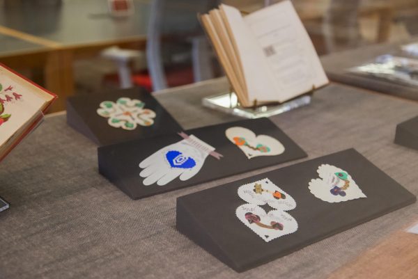
Beyond concerts and arts events, posters can also serve to spread the word on other vital campus resources. I caught College fourth-year and long-time Sexual Information Center staffer Tiffany Yuen in the middle of creating a handmade poster for a free STI testing event. Though Yuen often uses Canva to design infographics and promotions for sexual health events on campus, she reminisced about her recent discovery of handmade collages and posters in the SIC archives — a likely moment of inspiration for her current creative endeavor. These are not, however, the only kinds of posters that put a smile on Yuen’s face.
“I really liked the poster Anokha [Venugopal] made for the France vs. England game,” Yuen said. “It was an [Asian Diaspora Coalition] event, and it was also co-hosted by other identity orgs. It was really funny because it was France vs. England, right — two countries that are colonizers — but it was bread with beans and a baguette with a beret on it, so I think that was the last poster that made me laugh. I like posters that make me laugh and have a playful twist.”
From hilarious to aesthetically striking, minimalist to supplemental, posters act as unassuming propellers in the engine of Oberlin student life. Beyond the organized endeavor, they can even serve to spread the word on extra-extra-curricular events like house parties — a subject Yuen also touched on with a hint of whimsy in her eyes. Though it may strike as commonplace to all of us bouncing between the walls of the Oberlin bubble, we live in a pretty unique poster hub and have our peers to thank`.


