The Review’s Second Annual Art Contest
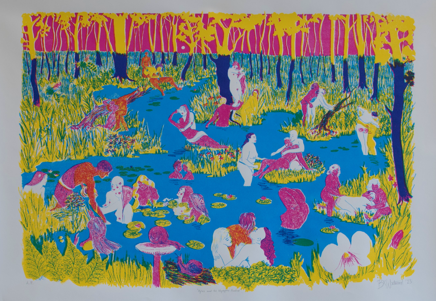
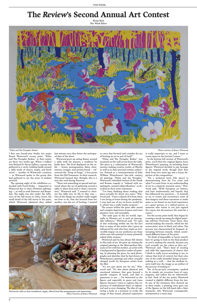
“Hylas and The Nymphs: Redux”
I first saw fourth-year Studio Art major Beaux Watwood’s screen print, “Hylas and The Nymphs: Redux,” at their senior art show two weeks ago. When I walked into Richard D. Baron Gallery, a group was gathered in a circle, holding hands around a table made of cherry, maple, and birch wood — another of Watwood’s creations — as Watwood spoke to the group that had gathered to see the array of student artwork.
The opening night of the exhibition coincided with Good Friday — important to Watwood due to their Christian upbringing — as well as with Passover and Ramadan. The night was also under the influence of the full moon in Libra, hence the small detail of the full moon in the print, which Watwood admitted they added last-minute once they knew the anticipated date of the show.
Watwood grew up eating dinner around a table with his parents, a tradition he holds dear. The food displayed on the table — honey, pomegranates, dates, clementines, oranges, and unrisen bread — referenced the “Song of Songs,” a love poem from the Old Testament. In their research, Watwood learned that, fittingly, this is a text also read during Passover.
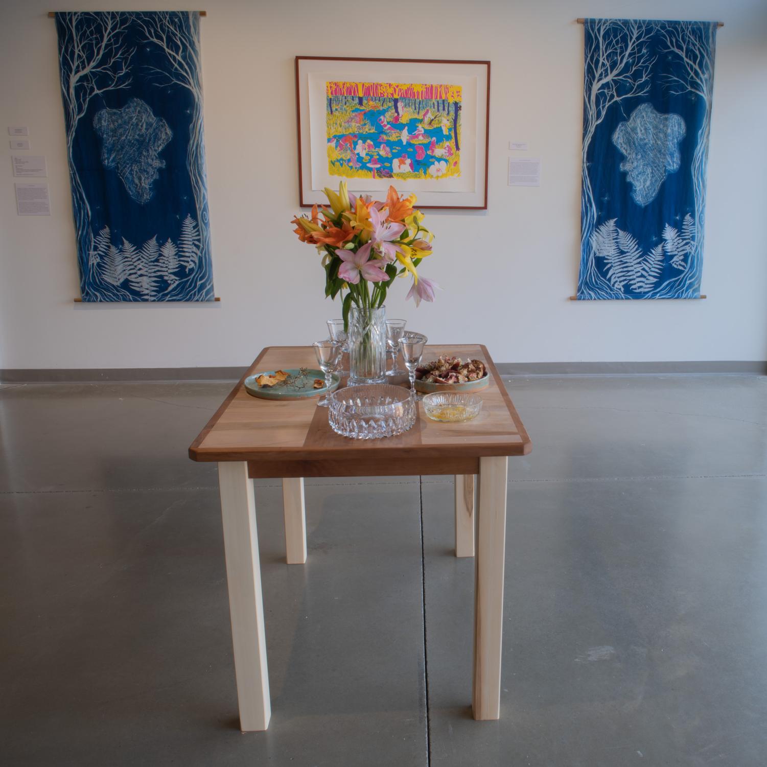
“There was something so special and universal about the act of gathering around a table to share food and to share conversation,” Watwood said. “I wanted to christen the table into its life in that way. … One of the things my mother really taught me how to do, that she learned from her mother, was the act of hosting. I wanted to carry that forward and consider the act of hosting an art in and of itself.”
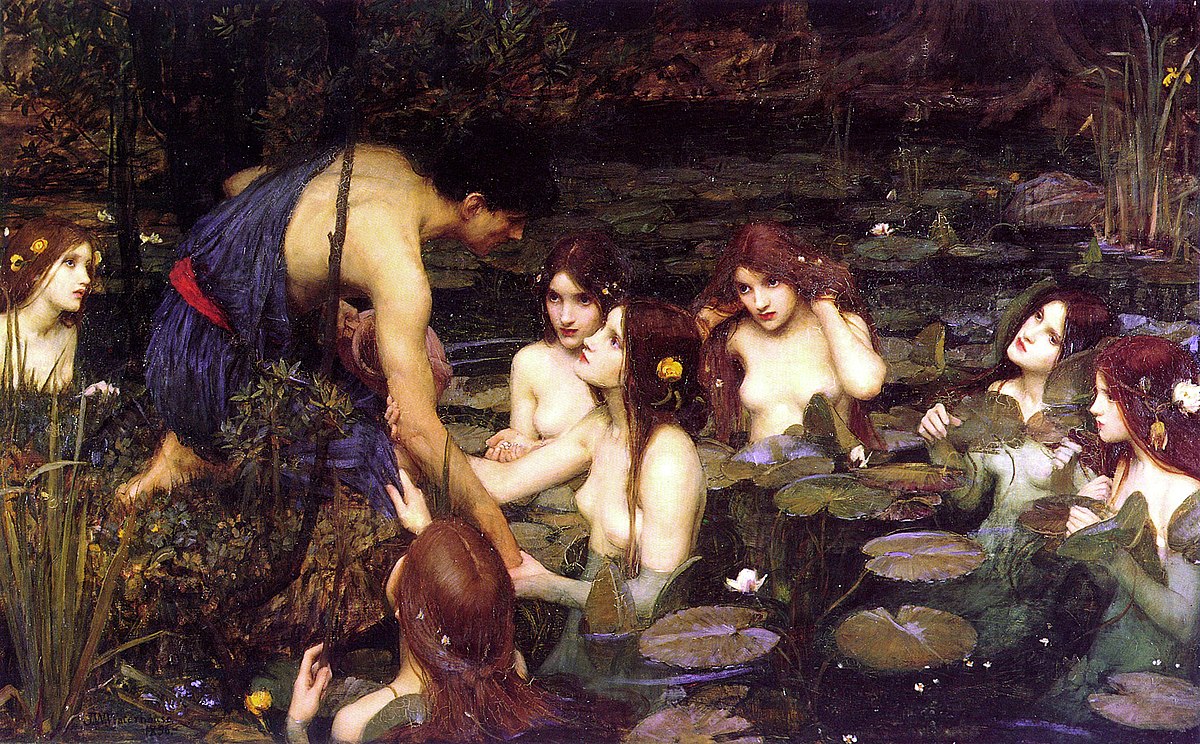
“Hylas and The Nymphs: Redux’’ was mounted on the wall across from the table. The piece is a culmination of Watwood’s journey making creative works, at Oberlin as well as in their personal artistic endeavors. Framed as a reinterpretation of John William Waterhouse’s late-19th century oil painting, “Hylas and the Nymphs,” Watwood’s refreshed version of the Greek and Roman tragedy is “imbued with unapologetic, sensual subjectification,” as described in their artist statement.
“I’ve been thinking about making that piece actually for about two years,” Watwood said. “I have a sketch of it from when I was living at home during the pandemic. I even had one of my ex-lovers model for it, which was a really tender moment.”
The scenes within the print offer varied and complex depictions of queer and trans pleasure, love, and sensuality.
“The male gaze in the art world, especially in Western art, is such an inescapable influence,” Watwood said. “It’s part of this reckoning within me for the fact that so many of the artists who I grew up influenced by and who have made an irreversible impact on my aesthetics are these white men who painted so many primarily naked white women.”
Watwood said he has always felt drawn to this style of art. He grew up visiting the original painting at the Metropolitan Museum of Art with his mother, an artist with a background in figurative realist oil painting. In planning the piece, he used photographs and sketches that he had drawn of Waterhouse’s painting and other sexually charged works by European artists from the Met.
“It’s not just about sex for me,” Watwood said. “It’s also about physical and emotional intimacy that goes beyond a specific category of touch, and that is queerness to me. … I’m interested in the figure, and especially in queer and trans figures, because I want to capture this experience of embodiment that’s so ephemeral and so ever-changing. The idea of capturing a body in a moment to evoke the image of that sexual, physical experience is really important to me, and I want to create space in the [artistic] canon.”
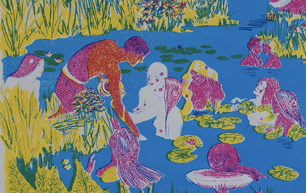
In the bottom left section of Watwood’s print, you’ll find the original figures from Waterhouse’s painting. In including these figures, Watwood decided to pay homage to the original work, though their first draft from two years ago was a looser depiction of the composition.
“On a technical level, [the piece] is demonstrating how far I’ve come and what I’ve come from, in my understanding of art in a classical, museum sense,” Watwood said. “With European art history, and how inadvertently and heavily that has influenced my practices, … [I wanted] to try to revisit and reconstruct some of that imagery and those narratives to make sense to me based on my lived experience as a queer person, as a radical person, as someone who wants to not just expand the canon, but deconstruct the need for a canon.”
For the screen print itself, they began by creating a mock-up using the digital painting software Procreate. From there, they started making the stencils, which for the screen print were in black and white. The process was characterized by frequent alternating between stencils, which constituted different layers of the print.
“It’s kind of impossible to know exactly how it’s going to look in the final product as you’re making the stencils, because you can’t actually see the colors as they are,” Watwood said. “That’s kind of exciting and adds this opportunity of chance that I think is really nerve-wracking to me, to release that level of control, but that’s also one of the really beautiful things of printmaking as a craft — that the medium inserts itself into the image as an artifact of the process of making it.”
The 27-by-40-inch screenprint, marked by its simple yet evocative hues of cyan, magenta, and yellow has an otherworldly feel. Each of the ten prints Watwood created is slightly different from the last. In one of the iterations they showed me in their studio, a printing error gave one of the figures on the left-hand side a faint mustache, who Watwood, consequently, interpreted as a trans man.


